DESIGNING WITH COLOR THEORY THROUGH FLOWERS
Design is everywhere, not just on screens, but also in the way colors, forms, and textures come together in the physical world. As a florist-designer, I often find myself applying the same principles of color theory and composition to flowers as I do to digital interfaces.
Insights
Apr 2, 2025

Everyday Romance: Peach & Cream Vase Arrangement
This smaller piece softened the palette with tints and tones of warm hues. Cream roses and peach ranunculus formed the calming base, while subtle yellow tulips and fresh greenery added dimension.
The overall effect was neutral grounding with accents: a design strategy that mirrors minimal digital interfaces with small, intentional details. It’s a reminder that not every design needs bold contrast; sometimes, harmony comes from restraint.
 |  |
Balancing Contrast: Large-Scale bouquet
This large hand-tied bouquet was an exploration of complementary balance. Cool blues and greens played against warm peaches and pinks, creating rhythm and movement. The spiky texture of blue thistles contrasted the rounded softness of roses, guiding the eye across the entire composition.
Just like in UX design, contrast wasn’t used for chaos but for clarity and flow. The arrangement demonstrates how balance between opposites brings life and energy into a design system.
 |  |

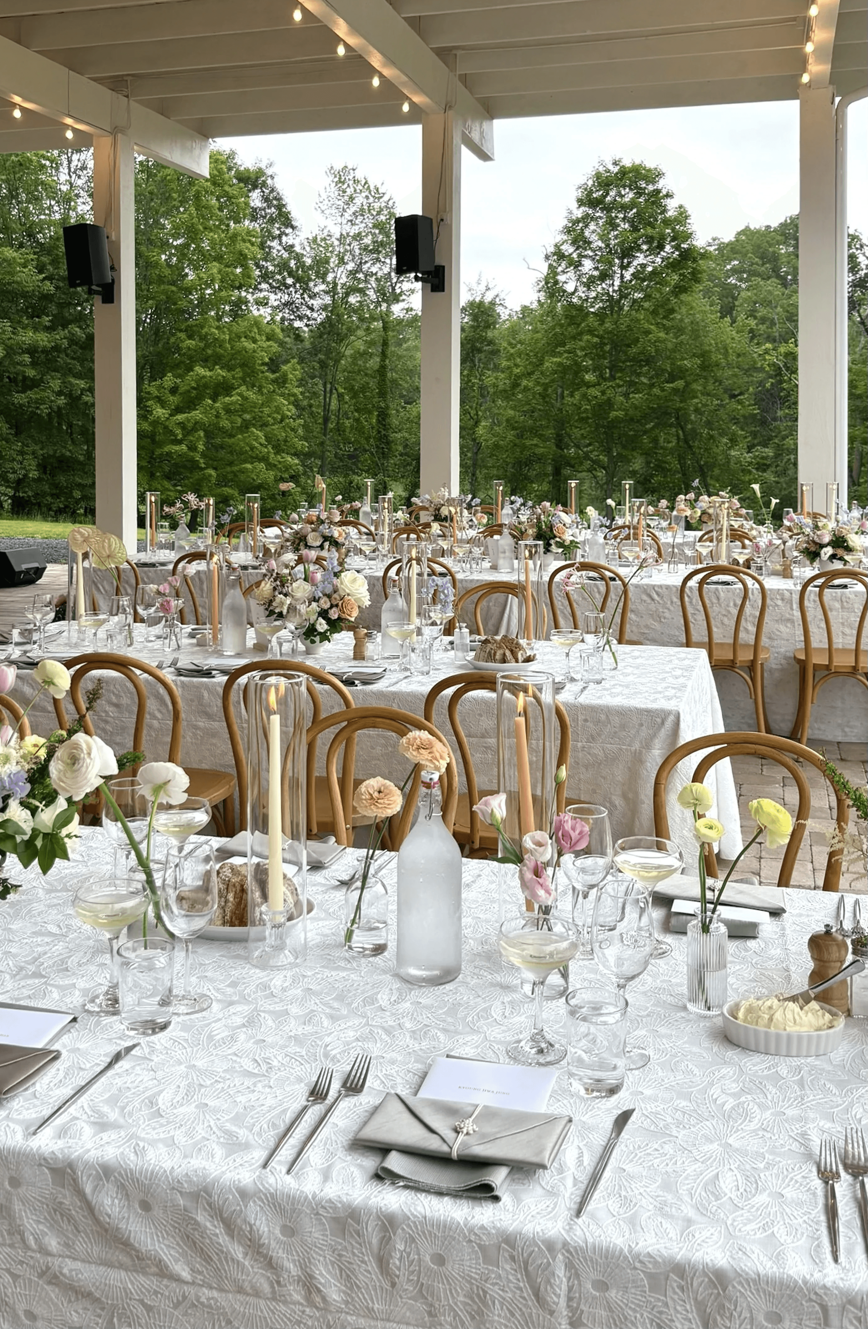
Setting the Scene: Outdoor Wedding Event
Several vase arrangements in varying sizes were designed for an outdoor wedding. Set against the soft greens of the trees, I chose romantic, delicate flowers: blush pink tulips, lavender sweet peas, creamy white astilbes, and lush greenery.
From a color theory perspective, the palette leaned into analogous harmony, blending neighboring hues of pink, purple, yellow, and white into a seamless flow. White roses served as visual anchors, adding contrast and giving the eye room to rest. In the open-air setting, these arrangements felt both delicate and radiant, showing how subtle tonal choices can transform the emotional atmosphere of an event.
 |  |
Sustainability in Design: Giving Flowers a Second Life
Not every design is about new materials. The dried bouquets and petite bouquet magnets were made from dried flowers of leftovers. By preserving and rearranging them, I was able to extend their beauty beyond their initial lifespan.
This approach reflects sustainable design thinking: valuing resources, reducing waste, and finding new forms of beauty in what already exists. The muted tones of dried roses, eucalyptus, and strawflowers carry a nostalgic quality, demonstrating that beauty doesn’t have to fade when freshness does.
Just as digital designers reuse components in design systems, florists too can practice modularity and reusability. Each stem is a resource, and sustainability lies in how thoughtfully we extend its story.
 |  |  |
Reflection
Working with flowers continues to teach me the same lessons I carry into UX and product design:
Color guides emotion. Soft harmonies or bold contrasts set the tone of an experience.
Composition tells a story. Arrangements, like interfaces, guide the eye and create rhythm.
Sustainability adds value. Reuse, recycle, and redesign—whether in pixels or petals—makes creativity more responsible.
Flowers may fade, but the design principles behind them last.
More to Discover


DESIGNING WITH COLOR THEORY THROUGH FLOWERS
Design is everywhere, not just on screens, but also in the way colors, forms, and textures come together in the physical world. As a florist-designer, I often find myself applying the same principles of color theory and composition to flowers as I do to digital interfaces.
Insights
Apr 2, 2025
Everyday Romance: Peach & Cream Vase Arrangement
This smaller piece softened the palette with tints and tones of warm hues. Cream roses and peach ranunculus formed the calming base, while subtle yellow tulips and fresh greenery added dimension.
The overall effect was neutral grounding with accents: a design strategy that mirrors minimal digital interfaces with small, intentional details. It’s a reminder that not every design needs bold contrast; sometimes, harmony comes from restraint.
| |
Balancing Contrast: Large-Scale bouquet
This large hand-tied bouquet was an exploration of complementary balance. Cool blues and greens played against warm peaches and pinks, creating rhythm and movement. The spiky texture of blue thistles contrasted the rounded softness of roses, guiding the eye across the entire composition.
Just like in UX design, contrast wasn’t used for chaos but for clarity and flow. The arrangement demonstrates how balance between opposites brings life and energy into a design system.
| |
Setting the Scene: Outdoor Wedding Event
Several vase arrangements in varying sizes were designed for an outdoor wedding. Set against the soft greens of the trees, I chose romantic, delicate flowers: blush pink tulips, lavender sweet peas, creamy white astilbes, and lush greenery.
From a color theory perspective, the palette leaned into analogous harmony, blending neighboring hues of pink, purple, yellow, and white into a seamless flow. White roses served as visual anchors, adding contrast and giving the eye room to rest. In the open-air setting, these arrangements felt both delicate and radiant, showing how subtle tonal choices can transform the emotional atmosphere of an event.
| |
Sustainability in Design: Giving Flowers a Second Life
Not every design is about new materials. The dried bouquets and petite bouquet magnets were made from dried flowers of leftovers. By preserving and rearranging them, I was able to extend their beauty beyond their initial lifespan.
This approach reflects sustainable design thinking: valuing resources, reducing waste, and finding new forms of beauty in what already exists. The muted tones of dried roses, eucalyptus, and strawflowers carry a nostalgic quality, demonstrating that beauty doesn’t have to fade when freshness does.
Just as digital designers reuse components in design systems, florists too can practice modularity and reusability. Each stem is a resource, and sustainability lies in how thoughtfully we extend its story.
| | |
Reflection
Working with flowers continues to teach me the same lessons I carry into UX and product design:
Color guides emotion. Soft harmonies or bold contrasts set the tone of an experience.
Composition tells a story. Arrangements, like interfaces, guide the eye and create rhythm.
Sustainability adds value. Reuse, recycle, and redesign—whether in pixels or petals—makes creativity more responsible.
Flowers may fade, but the design principles behind them last.
More to Discover
DESIGNING WITH COLOR THEORY THROUGH FLOWERS
Design is everywhere, not just on screens, but also in the way colors, forms, and textures come together in the physical world. As a florist-designer, I often find myself applying the same principles of color theory and composition to flowers as I do to digital interfaces.
Insights
Apr 2, 2025
Everyday Romance: Peach & Cream Vase Arrangement
This smaller piece softened the palette with tints and tones of warm hues. Cream roses and peach ranunculus formed the calming base, while subtle yellow tulips and fresh greenery added dimension.
The overall effect was neutral grounding with accents: a design strategy that mirrors minimal digital interfaces with small, intentional details. It’s a reminder that not every design needs bold contrast; sometimes, harmony comes from restraint.
| |
Balancing Contrast: Large-Scale bouquet
This large hand-tied bouquet was an exploration of complementary balance. Cool blues and greens played against warm peaches and pinks, creating rhythm and movement. The spiky texture of blue thistles contrasted the rounded softness of roses, guiding the eye across the entire composition.
Just like in UX design, contrast wasn’t used for chaos but for clarity and flow. The arrangement demonstrates how balance between opposites brings life and energy into a design system.
| |
Setting the Scene: Outdoor Wedding Event
Several vase arrangements in varying sizes were designed for an outdoor wedding. Set against the soft greens of the trees, I chose romantic, delicate flowers: blush pink tulips, lavender sweet peas, creamy white astilbes, and lush greenery.
From a color theory perspective, the palette leaned into analogous harmony, blending neighboring hues of pink, purple, yellow, and white into a seamless flow. White roses served as visual anchors, adding contrast and giving the eye room to rest. In the open-air setting, these arrangements felt both delicate and radiant, showing how subtle tonal choices can transform the emotional atmosphere of an event.
| |
Sustainability in Design: Giving Flowers a Second Life
Not every design is about new materials. The dried bouquets and petite bouquet magnets were made from dried flowers of leftovers. By preserving and rearranging them, I was able to extend their beauty beyond their initial lifespan.
This approach reflects sustainable design thinking: valuing resources, reducing waste, and finding new forms of beauty in what already exists. The muted tones of dried roses, eucalyptus, and strawflowers carry a nostalgic quality, demonstrating that beauty doesn’t have to fade when freshness does.
Just as digital designers reuse components in design systems, florists too can practice modularity and reusability. Each stem is a resource, and sustainability lies in how thoughtfully we extend its story.
| | |
Reflection
Working with flowers continues to teach me the same lessons I carry into UX and product design:
Color guides emotion. Soft harmonies or bold contrasts set the tone of an experience.
Composition tells a story. Arrangements, like interfaces, guide the eye and create rhythm.
Sustainability adds value. Reuse, recycle, and redesign—whether in pixels or petals—makes creativity more responsible.
Flowers may fade, but the design principles behind them last.