Responsive Web Design
BRIDGECODE
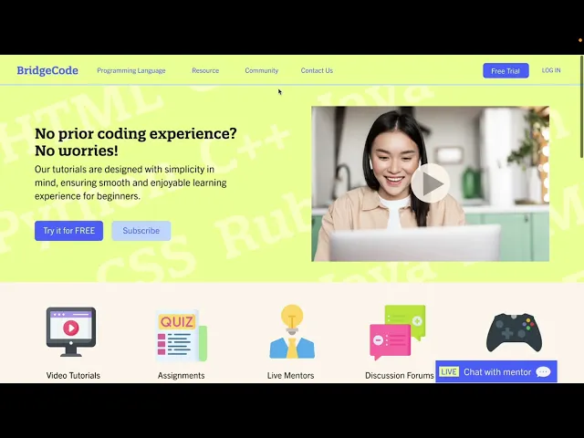
BridgeCode is an educational platform designed to help beginners approach coding with confidence. The project focuses on reducing intimidation by making learning more visual, interactive, and approachable for first time learners.
Year :
2023
Industry :
EdTech
Tool :
Adobe XD
Project Duration :
5 weeks

Research & Insights
What I did | Key Findings | Takeaway |
|---|---|---|
|
| Coding education should feel clear, visual, and interactive rather than intimidating or overwhelming. |
User Persona
 |
|
|---|
Problem & Solution Statement
Problem | Solution |
|---|---|
First time learners feel overwhelmed by coding platforms that are difficult to understand and lack engagement. | Design a welcoming learning platform that presents coding concepts through clear structure, interactive tutorials, and community support. |
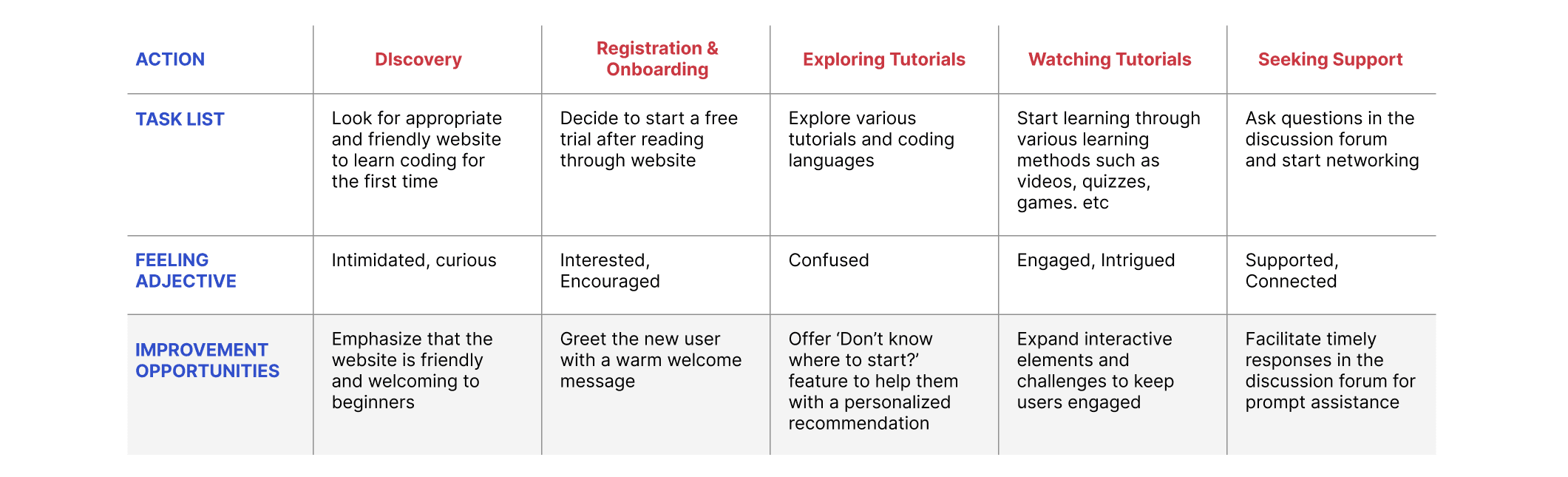
Future User Journey Map
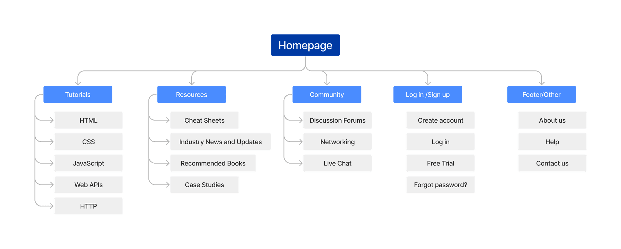
INFORMATION ARCHITECTURE
Paper Wireframes
I sketched five paper wireframes for the landing page to explore different layouts. The final design clarified the information hierarchy and was adapted for responsive use.
 |  |
Usability Testing & Refinement
Unmoderated in-person tests were conducted with five participants interested in learning coding online.
Participants varied in age, gender, race, and ethnicity.
Round 1 Findings |
|---|
|
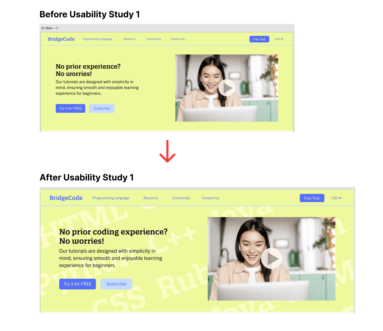 Early designs lacked clarity about the website's focus on coding tutorials. Therefore, I specified the website's purpose by adding a background pattern of coding-related words. |
Round 2 Findings |
|---|
|
 The initial designs displayed the full date of each post. After conducting usability studies, I updated this to show the number of days since each post was uploaded for better clarity. |
Accessibility Considerations
Color choices met contrast standards for readability
Fonts were selected for legibility and comfortable reading
Icons were paired with text to support comprehension
Accessibility decisions were made to support learners with varying comfort levels and abilities.
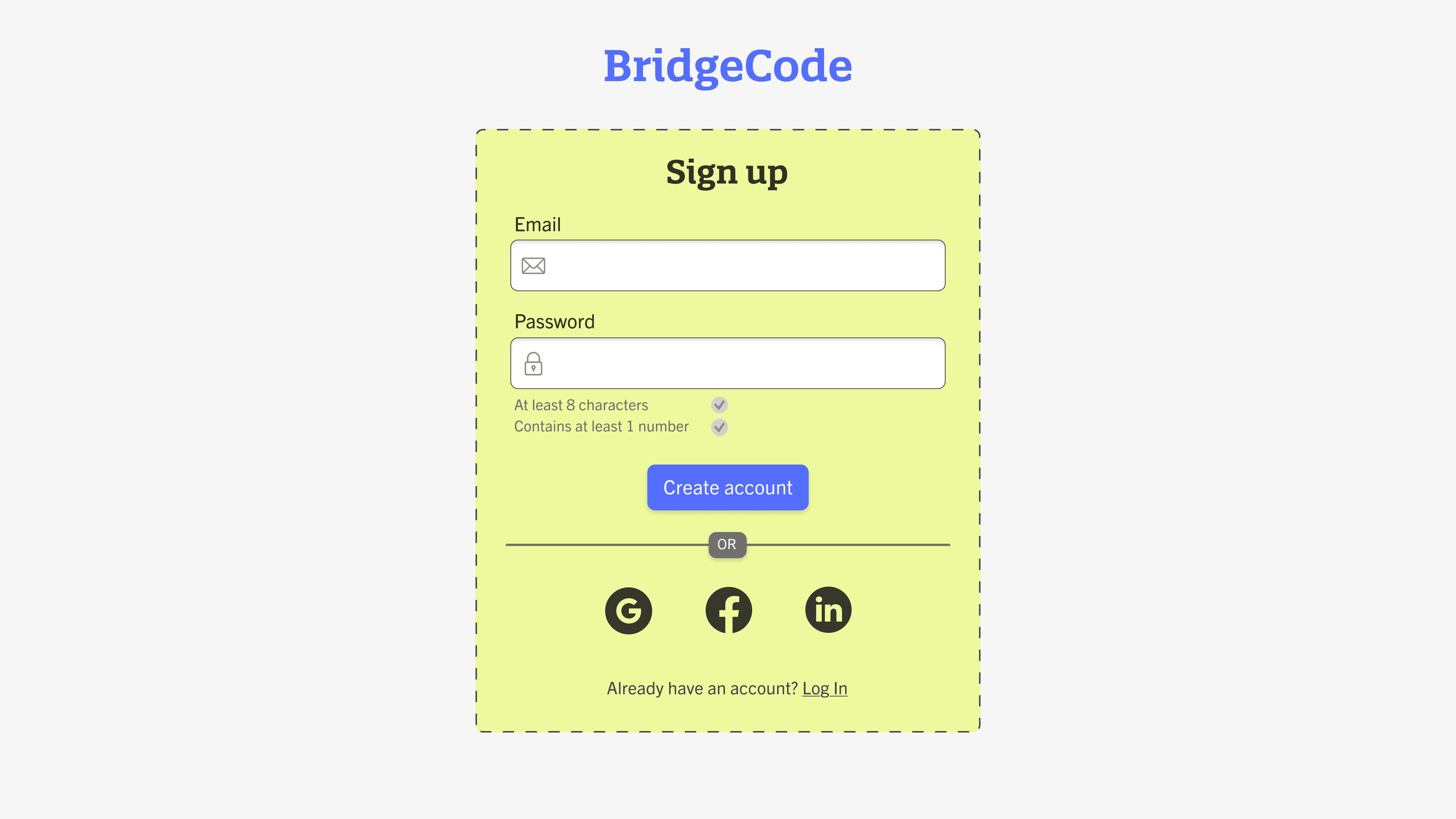
Full Mockup


Prototype
Click below to take a look at the full prototype:
Instruction: select ‘Python’ to check the coding tutorials and ‘Discussion Forum’ under ‘Community’ to check the community.
Takeaways
Impact | What I Learned |
|---|---|
Many were excited about the concept of a welcoming and approachable e-learning coding website for first-timers. | This project taught me the importance of simplicity when designing for complex topics. By breaking information into clear categories and supporting learners emotionally as well as functionally, design can reduce hesitation and build confidence. It also reinforced the value of user feedback in shaping not just usability, but how welcoming a product feels to first time users. |
More Projects


Responsive Web Design
BRIDGECODE
BridgeCode is an educational platform designed to help beginners approach coding with confidence. The project focuses on reducing intimidation by making learning more visual, interactive, and approachable for first time learners.
Year :
2023
Industry :
EdTech
Tool :
Adobe XD
Project Duration :
5 weeks
Research & Insights
What I did | Key Findings | Takeaway |
|---|---|---|
|
| Coding education should feel clear, visual, and interactive rather than intimidating or overwhelming. |
User Persona
|
|
|---|
Problem & Solution Statement
Problem | Solution |
|---|---|
First time learners feel overwhelmed by coding platforms that are difficult to understand and lack engagement. | Design a welcoming learning platform that presents coding concepts through clear structure, interactive tutorials, and community support. |
Future User Journey Map
INFORMATION ARCHITECTURE
Paper Wireframes
I sketched five paper wireframes for the landing page to explore different layouts. The final design clarified the information hierarchy and was adapted for responsive use.
| |
Usability Testing & Refinement
Unmoderated in-person tests were conducted with five participants interested in learning coding online.
Participants varied in age, gender, race, and ethnicity.
Round 1 Findings |
|---|
|
Early designs lacked clarity about the website's focus on coding tutorials. Therefore, I specified the website's purpose by adding a background pattern of coding-related words. |
Round 2 Findings |
|---|
|
The initial designs displayed the full date of each post. After conducting usability studies, I updated this to show the number of days since each post was uploaded for better clarity. |
Accessibility Considerations
Color choices met contrast standards for readability
Fonts were selected for legibility and comfortable reading
Icons were paired with text to support comprehension
Accessibility decisions were made to support learners with varying comfort levels and abilities.
Full Mockup
Prototype
Click below to take a look at the full prototype:
Instruction: select ‘Python’ to check the coding tutorials and ‘Discussion Forum’ under ‘Community’ to check the community.
Takeaways
Impact | What I Learned |
|---|---|
Many were excited about the concept of a welcoming and approachable e-learning coding website for first-timers. | This project taught me the importance of simplicity when designing for complex topics. By breaking information into clear categories and supporting learners emotionally as well as functionally, design can reduce hesitation and build confidence. It also reinforced the value of user feedback in shaping not just usability, but how welcoming a product feels to first time users. |
More Projects
Responsive Web Design
BRIDGECODE
BridgeCode is an educational platform designed to help beginners approach coding with confidence. The project focuses on reducing intimidation by making learning more visual, interactive, and approachable for first time learners.
Year :
2023
Industry :
EdTech
Tool :
Adobe XD
Project Duration :
5 weeks
Research & Insights
What I did | Key Findings | Takeaway |
|---|---|---|
|
| Coding education should feel clear, visual, and interactive rather than intimidating or overwhelming. |
User Persona
|
|
|---|
Problem & Solution Statement
Problem | Solution |
|---|---|
First time learners feel overwhelmed by coding platforms that are difficult to understand and lack engagement. | Design a welcoming learning platform that presents coding concepts through clear structure, interactive tutorials, and community support. |
Future User Journey Map
INFORMATION ARCHITECTURE
Paper Wireframes
I sketched five paper wireframes for the landing page to explore different layouts. The final design clarified the information hierarchy and was adapted for responsive use.
| |
Usability Testing & Refinement
Unmoderated in-person tests were conducted with five participants interested in learning coding online.
Participants varied in age, gender, race, and ethnicity.
Round 1 Findings |
|---|
|
Early designs lacked clarity about the website's focus on coding tutorials. Therefore, I specified the website's purpose by adding a background pattern of coding-related words. |
Round 2 Findings |
|---|
|
The initial designs displayed the full date of each post. After conducting usability studies, I updated this to show the number of days since each post was uploaded for better clarity. |
Accessibility Considerations
Color choices met contrast standards for readability
Fonts were selected for legibility and comfortable reading
Icons were paired with text to support comprehension
Accessibility decisions were made to support learners with varying comfort levels and abilities.
Full Mockup
Prototype
Click below to take a look at the full prototype:
Instruction: select ‘Python’ to check the coding tutorials and ‘Discussion Forum’ under ‘Community’ to check the community.
Takeaways
Impact | What I Learned |
|---|---|
Many were excited about the concept of a welcoming and approachable e-learning coding website for first-timers. | This project taught me the importance of simplicity when designing for complex topics. By breaking information into clear categories and supporting learners emotionally as well as functionally, design can reduce hesitation and build confidence. It also reinforced the value of user feedback in shaping not just usability, but how welcoming a product feels to first time users. |