UI/UX Design
SAFE WALK
Safe Walk is a mobile navigation concept designed to support NYU students who commute alone at night. The app focuses on real time safety awareness, community reporting, and clear route guidance to help users feel more confident moving through the city.
Year :
2025
Industry :
Health & Safety
Tool :
Figma
Project Duration :
6 weeks

PROBLEM STATEMENT
Students walking alone at night face risks related to theft, harassment, and violence. These concerns are heightened for students who feel especially vulnerable, including international students and students affected by racial targeting.
Current tools do not provide enough situational awareness or reassurance during a commute. Students need a way to understand potential risks, react quickly, and feel supported while navigating unfamiliar or uncomfortable routes.
SOLUTION STATEMENT
Safe Walk proposes a navigation experience that layers safety information onto familiar route guidance.
The app allows students, faculty, staff, and campus safety to report incidents, making nearby users aware of potential risks in real time. By combining navigation, alerts, and community input, the app aims to increase confidence moving through the city.


RESEARCH & ANALYSIS
20.1% of NY residents feel ‘very unsafe’ when walking alone at night.
61.3% of NY residents perceive negatively about pedestrian safety.
37.1% of NY residents don’t feel positive about public safety.
10298 crimes were reported in New York during December 2024.
COMPETITIVE AUDIT
A mobile app that sends a preset message to six contacts with just one click.  Strengths: Simple functionality | A mobile app that estimates arrival time, triggers an alarm if not deactivated by the ETA, enables real-time texting with campus safety, and allows location sharing. 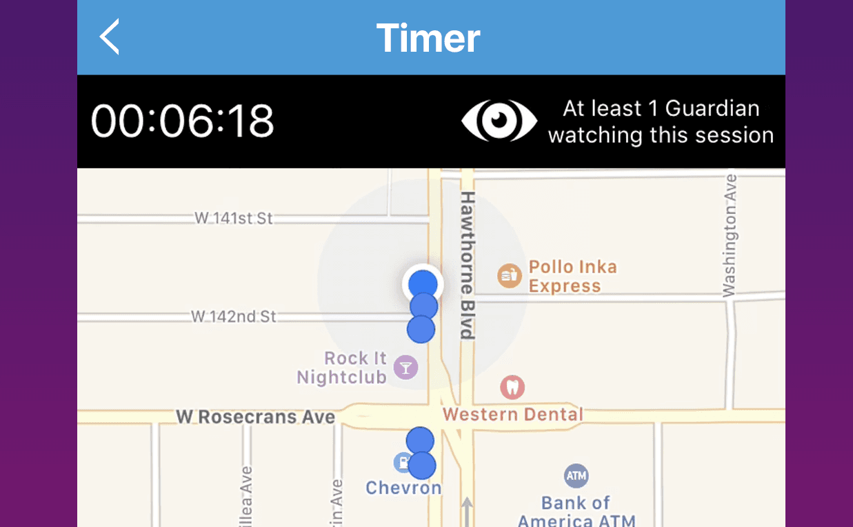 Strengths: Configured by the universities the user is associated with |
USER PERSONA
 Name: Jane Lee | Goals |
|---|
Journey Mapping
Current | Future |
 |  |
|---|
Accessibility Considerations
Accessibility was considered throughout the design process.
Color choices met WCAG contrast standards to ensure readability
Icons were designed to be clear and intuitive
Content was written to be concise and easy to scan
Users can choose between metric and imperial units
Users can adjust how much risk information they see
These decisions aimed to support different needs and preferences.
Usability Testing
Five in-person interviews were conducted with participants with late-night classes and study sessions on campus.
Round 1 Findings |
|---|
|
Round 2 Findings |
|---|
|
Refinement
BEFORE | AFTER | |
|---|---|---|
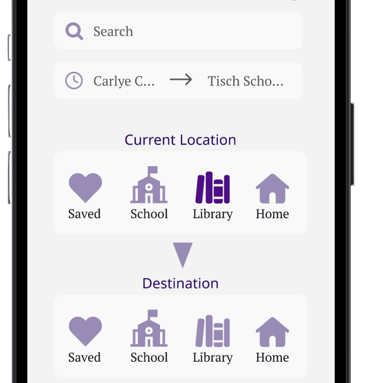 | 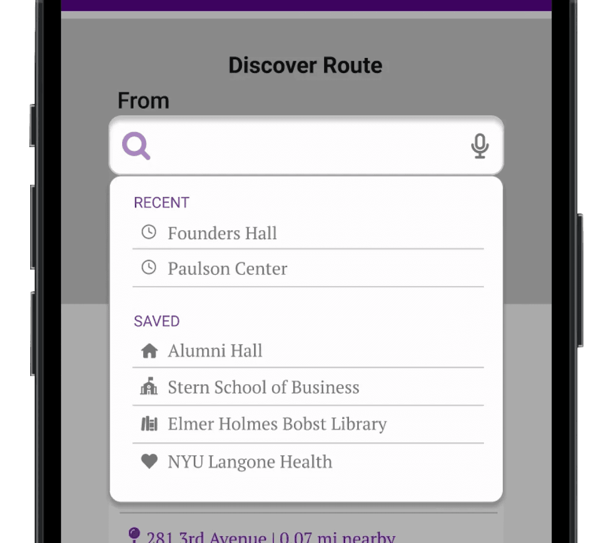 | |
Too many options to choose from when searching for a route. | Two input fields—‘From’ and ‘To’—with saved locations available as dropdown options. |
BEFORE | AFTER | |
|---|---|---|
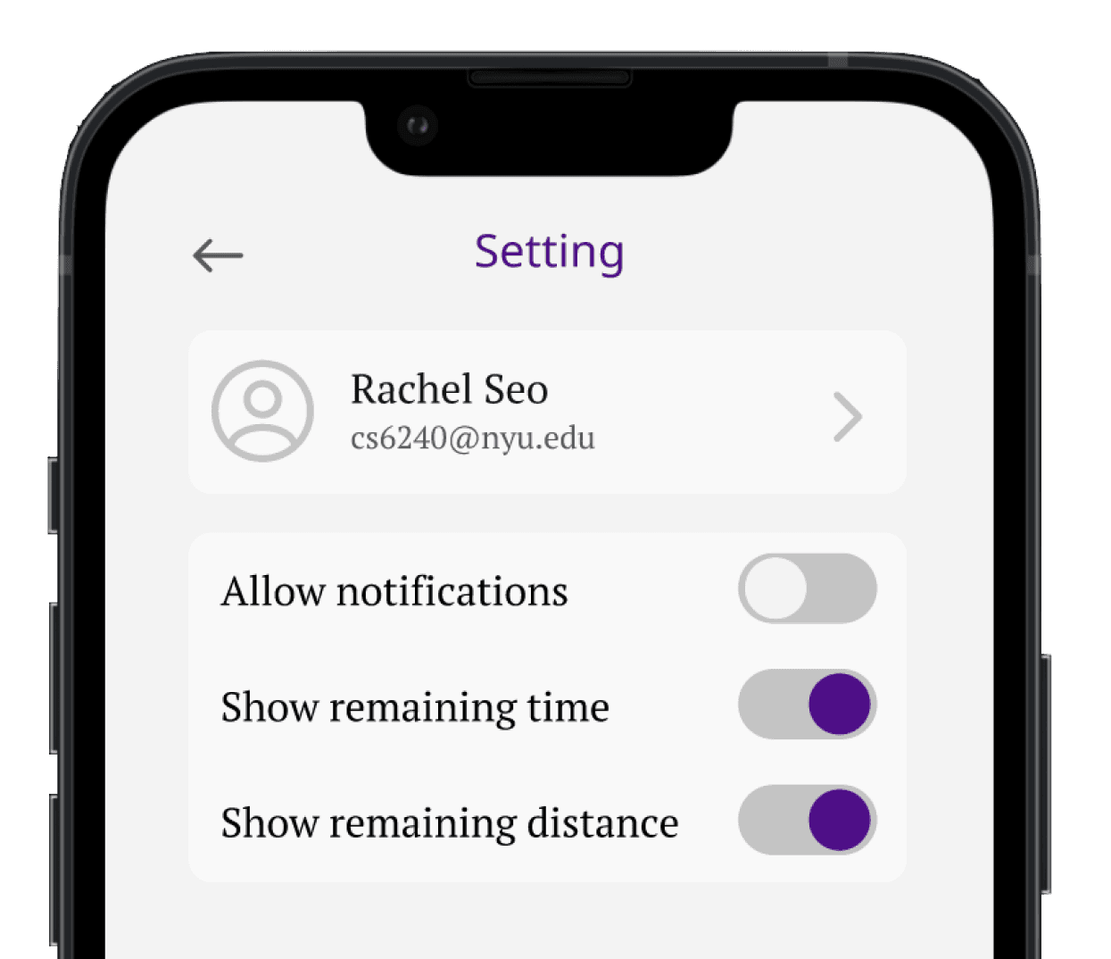 | 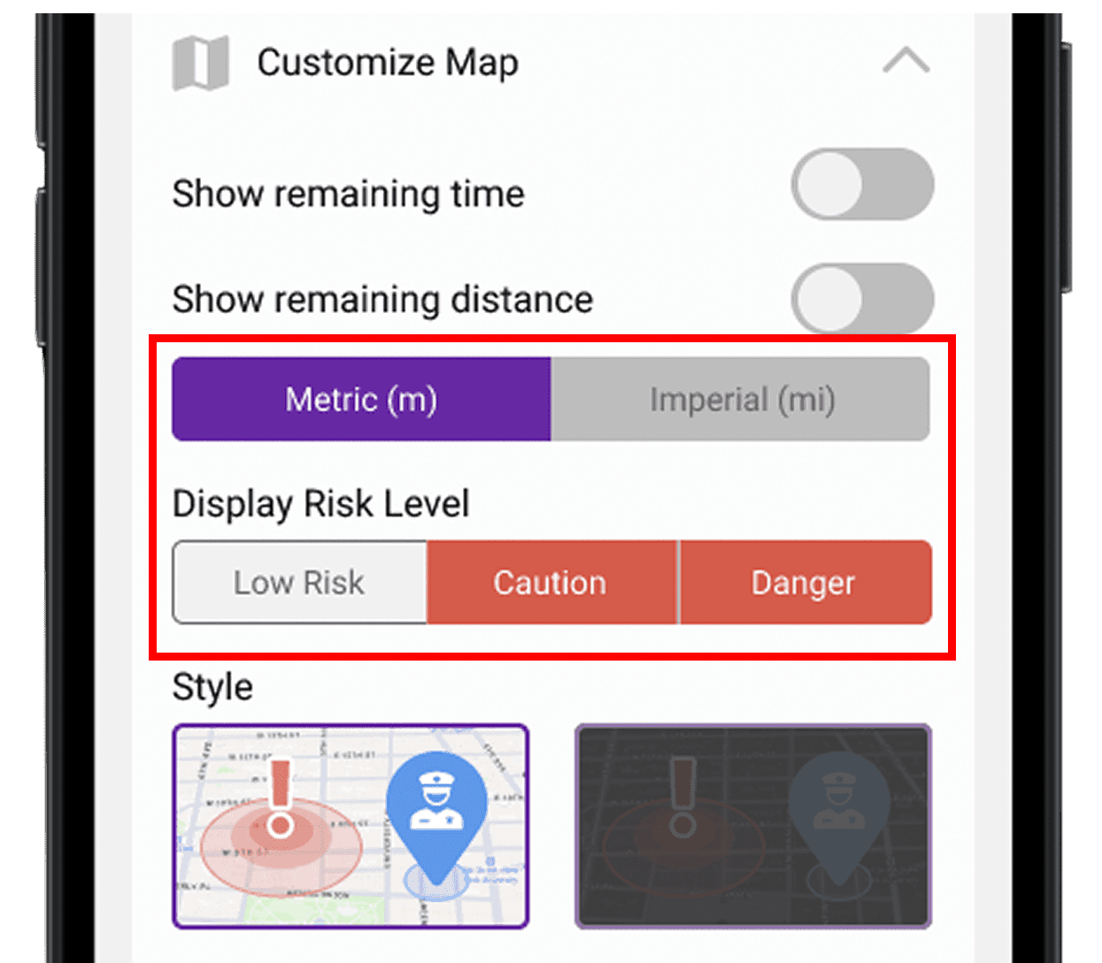 | |
Not inclusive to international users. | Options to choose: |
High Fidelity Mockup


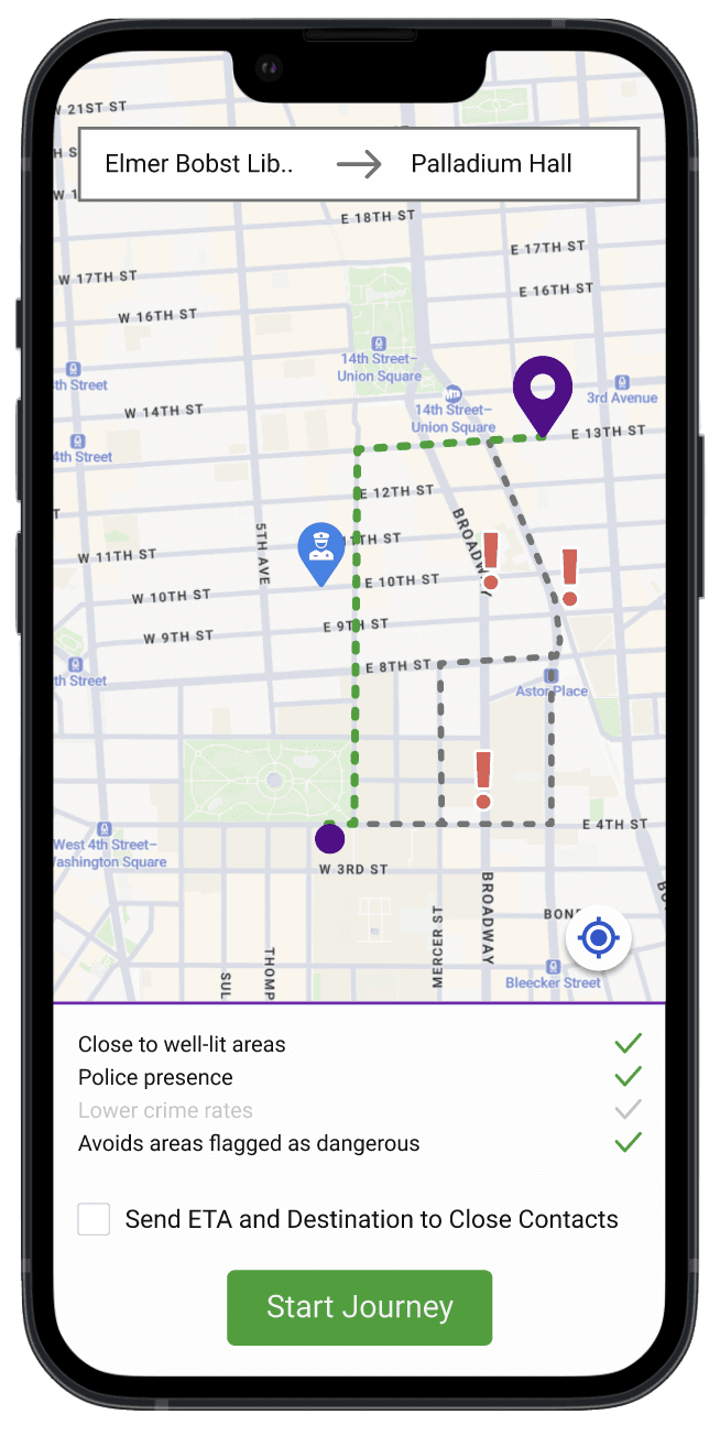
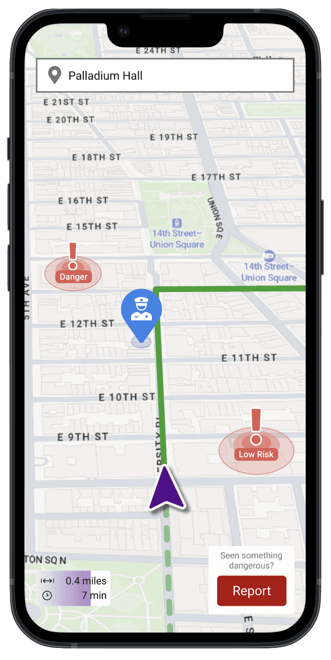
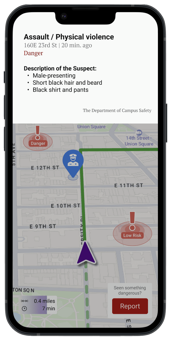


Designing for Apple Watch & Further Revision
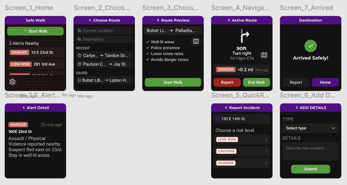
I adapted the core navigation experience for Apple Watch, allowing users to access directions and important alerts at a glance while keeping their phone away.
I used Figma AI to adapt my mobile screens for Apple Watch, which gave me a helpful starting point and saved time. I then used my UX judgment to simplify the layout, information, and interactions for the smaller screen rather than relying on AI for the final design.
Before:
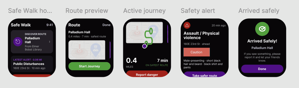
After:
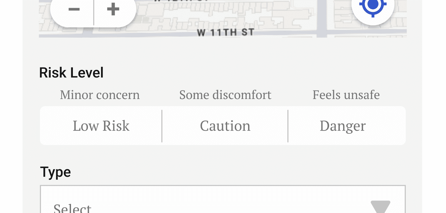
As I revisited this project a few months later, I noticed that “Low Risk,” “Caution,” and “Danger” might be open to interpretation. Therefore, I refined the system by adding clear definitions to each level.
Takeaways
Impact | Reflection |
This app boosts users' confidence and sense of safety when walking alone in the city. Many expressed interest in using it if developed. | This project reinforced the importance of designing for emotional context, not just functionality. Safety related products must balance awareness with reassurance, especially in high stress situations. I learned that giving users control over information builds trust, and that inclusive design decisions such as unit preferences can significantly improve usability for diverse audiences. |
More Projects



UI/UX Design
SAFE WALK
Safe Walk is a mobile navigation concept designed to support NYU students who commute alone at night. The app focuses on real time safety awareness, community reporting, and clear route guidance to help users feel more confident moving through the city.
Year :
2025
Industry :
Health & Safety
Tool :
Figma
Project Duration :
6 weeks
PROBLEM STATEMENT
Students walking alone at night face risks related to theft, harassment, and violence. These concerns are heightened for students who feel especially vulnerable, including international students and students affected by racial targeting.
Current tools do not provide enough situational awareness or reassurance during a commute. Students need a way to understand potential risks, react quickly, and feel supported while navigating unfamiliar or uncomfortable routes.
SOLUTION STATEMENT
Safe Walk proposes a navigation experience that layers safety information onto familiar route guidance.
The app allows students, faculty, staff, and campus safety to report incidents, making nearby users aware of potential risks in real time. By combining navigation, alerts, and community input, the app aims to increase confidence moving through the city.
RESEARCH & ANALYSIS
20.1% of NY residents feel ‘very unsafe’ when walking alone at night.
61.3% of NY residents perceive negatively about pedestrian safety.
37.1% of NY residents don’t feel positive about public safety.
10298 crimes were reported in New York during December 2024.
COMPETITIVE AUDIT
A mobile app that sends a preset message to six contacts with just one click. Strengths: Simple functionality | A mobile app that estimates arrival time, triggers an alarm if not deactivated by the ETA, enables real-time texting with campus safety, and allows location sharing. Strengths: Configured by the universities the user is associated with |
USER PERSONA
Name: Jane Lee | Goals |
|---|
Journey Mapping
Current | Future |
| |
|---|
Accessibility Considerations
Accessibility was considered throughout the design process.
Color choices met WCAG contrast standards to ensure readability
Icons were designed to be clear and intuitive
Content was written to be concise and easy to scan
Users can choose between metric and imperial units
Users can adjust how much risk information they see
These decisions aimed to support different needs and preferences.
Usability Testing
Five in-person interviews were conducted with participants with late-night classes and study sessions on campus.
Round 1 Findings |
|---|
|
Round 2 Findings |
|---|
|
Refinement
BEFORE | AFTER | |
|---|---|---|
| | |
Too many options to choose from when searching for a route. | Two input fields—‘From’ and ‘To’—with saved locations available as dropdown options. |
BEFORE | AFTER | |
|---|---|---|
| | |
Not inclusive to international users. | Options to choose: |
High Fidelity Mockup
Designing for Apple Watch & Further Revision
I adapted the core navigation experience for Apple Watch, allowing users to access directions and important alerts at a glance while keeping their phone away.
I used Figma AI to adapt my mobile screens for Apple Watch, which gave me a helpful starting point and saved time. I then used my UX judgment to simplify the layout, information, and interactions for the smaller screen rather than relying on AI for the final design.
Before:
After:
As I revisited this project a few months later, I noticed that “Low Risk,” “Caution,” and “Danger” might be open to interpretation. Therefore, I refined the system by adding clear definitions to each level.
Takeaways
Impact | Reflection |
This app boosts users' confidence and sense of safety when walking alone in the city. Many expressed interest in using it if developed. | This project reinforced the importance of designing for emotional context, not just functionality. Safety related products must balance awareness with reassurance, especially in high stress situations. I learned that giving users control over information builds trust, and that inclusive design decisions such as unit preferences can significantly improve usability for diverse audiences. |
More Projects
UI/UX Design
SAFE WALK
Safe Walk is a mobile navigation concept designed to support NYU students who commute alone at night. The app focuses on real time safety awareness, community reporting, and clear route guidance to help users feel more confident moving through the city.
Year :
2025
Industry :
Health & Safety
Tool :
Figma
Project Duration :
6 weeks
PROBLEM STATEMENT
Students walking alone at night face risks related to theft, harassment, and violence. These concerns are heightened for students who feel especially vulnerable, including international students and students affected by racial targeting.
Current tools do not provide enough situational awareness or reassurance during a commute. Students need a way to understand potential risks, react quickly, and feel supported while navigating unfamiliar or uncomfortable routes.
SOLUTION STATEMENT
Safe Walk proposes a navigation experience that layers safety information onto familiar route guidance.
The app allows students, faculty, staff, and campus safety to report incidents, making nearby users aware of potential risks in real time. By combining navigation, alerts, and community input, the app aims to increase confidence moving through the city.
RESEARCH & ANALYSIS
20.1% of NY residents feel ‘very unsafe’ when walking alone at night.
61.3% of NY residents perceive negatively about pedestrian safety.
37.1% of NY residents don’t feel positive about public safety.
10298 crimes were reported in New York during December 2024.
COMPETITIVE AUDIT
A mobile app that sends a preset message to six contacts with just one click. Strengths: Simple functionality | A mobile app that estimates arrival time, triggers an alarm if not deactivated by the ETA, enables real-time texting with campus safety, and allows location sharing. Strengths: Configured by the universities the user is associated with |
USER PERSONA
Name: Jane Lee | Goals |
|---|
Journey Mapping
Current | Future |
| |
|---|
Accessibility Considerations
Accessibility was considered throughout the design process.
Color choices met WCAG contrast standards to ensure readability
Icons were designed to be clear and intuitive
Content was written to be concise and easy to scan
Users can choose between metric and imperial units
Users can adjust how much risk information they see
These decisions aimed to support different needs and preferences.
Usability Testing
Five in-person interviews were conducted with participants with late-night classes and study sessions on campus.
Round 1 Findings |
|---|
|
Round 2 Findings |
|---|
|
Refinement
BEFORE | AFTER | |
|---|---|---|
| | |
Too many options to choose from when searching for a route. | Two input fields—‘From’ and ‘To’—with saved locations available as dropdown options. |
BEFORE | AFTER | |
|---|---|---|
| | |
Not inclusive to international users. | Options to choose: |
High Fidelity Mockup
Designing for Apple Watch & Further Revision
I adapted the core navigation experience for Apple Watch, allowing users to access directions and important alerts at a glance while keeping their phone away.
I used Figma AI to adapt my mobile screens for Apple Watch, which gave me a helpful starting point and saved time. I then used my UX judgment to simplify the layout, information, and interactions for the smaller screen rather than relying on AI for the final design.
Before:
After:
As I revisited this project a few months later, I noticed that “Low Risk,” “Caution,” and “Danger” might be open to interpretation. Therefore, I refined the system by adding clear definitions to each level.
Takeaways
Impact | Reflection |
This app boosts users' confidence and sense of safety when walking alone in the city. Many expressed interest in using it if developed. | This project reinforced the importance of designing for emotional context, not just functionality. Safety related products must balance awareness with reassurance, especially in high stress situations. I learned that giving users control over information builds trust, and that inclusive design decisions such as unit preferences can significantly improve usability for diverse audiences. |