UX Research / Web Design
Internship Project: UX Research & Wireframing
A real world internship project focused on user research and low fidelity prototyping for an early stage AI-powered college planning platform. While the project paused during the startup’s investment phase, the research and design work established a clear foundation for future development.
Year :
2025
Industry :
AI
Tool :
Figma, FigJam
Project Duration :
3 months+

Overview
As a UI/UX Design Intern at an early stage startup, I worked on building a platform to support high school students through the college application process. I conducted competitive analysis, led user research and testing, and designed low-fidelity wireframes for features including AI driven college matching and application tracking.
My Role
UX Researcher & UI/UX Designer
Collaborated with: Founder and Design team
Focus areas: user research, user interview, ideation, and wireframing
Problem Statement
High school students manage college applications across fragmented tools such as spreadsheets, search platforms, and school portals. This creates stress, missed deadlines, and difficulty comparing options.
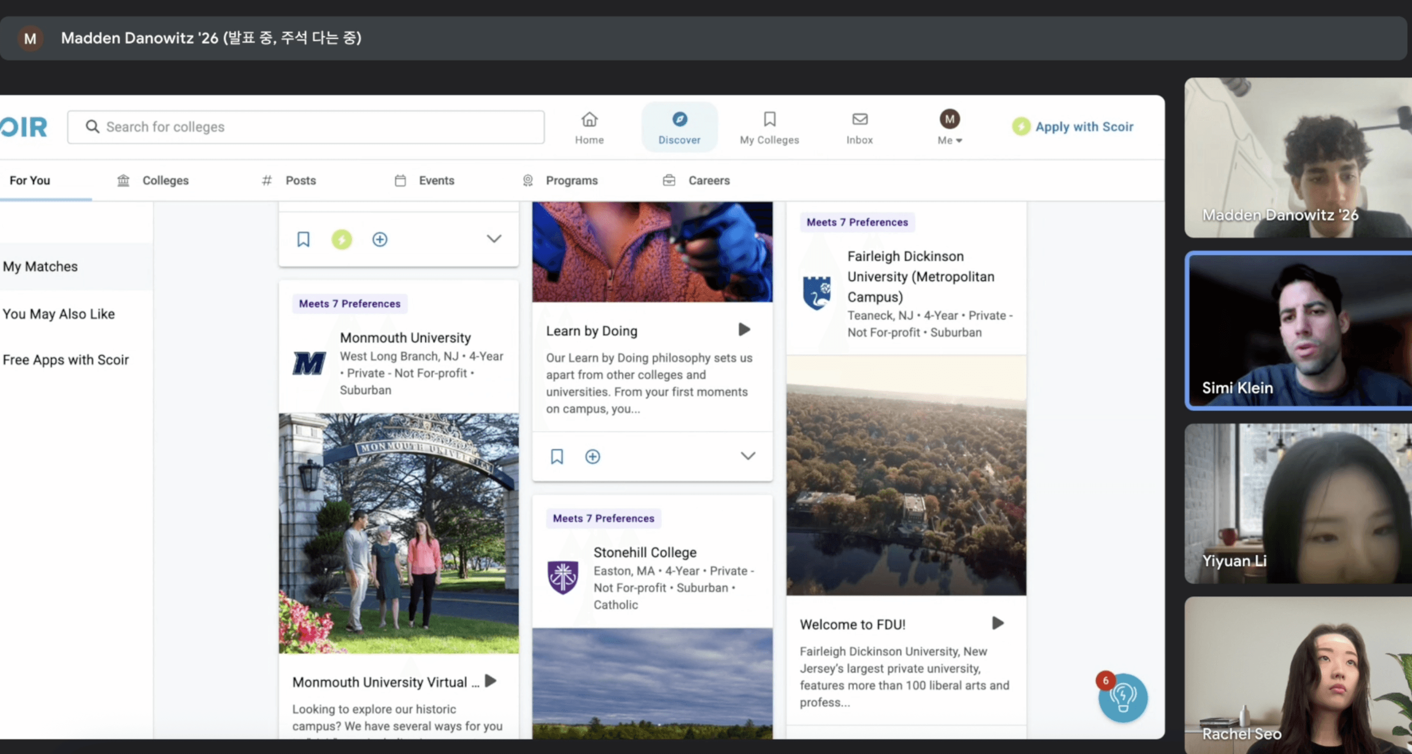
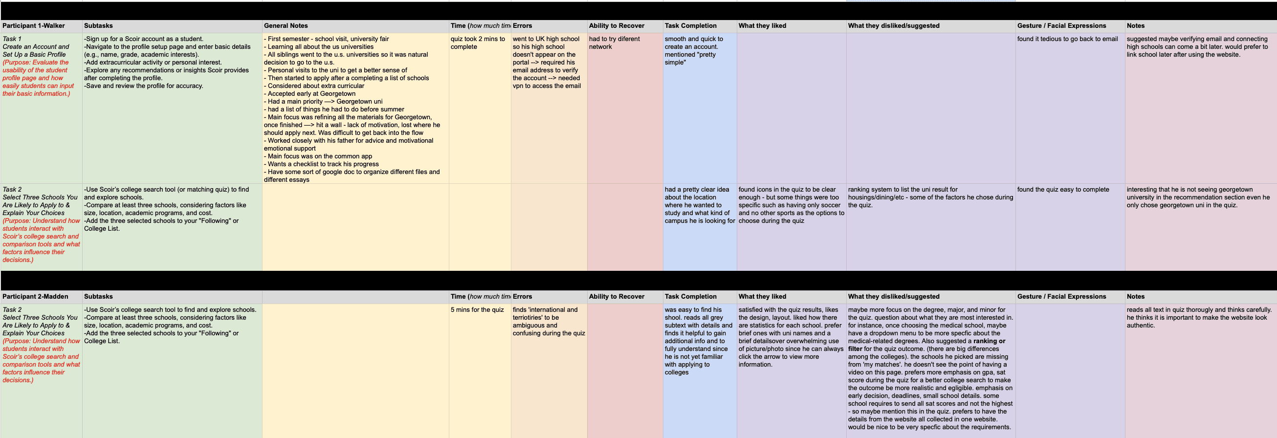
In testing an existing market tool, students found AI matching features unclear and difficult to trust. Important decision making details such as GPA requirements, test policies, and early decision rules were hard to find, leaving students unsure how recommendations were generated.
Students needed a single workspace that organized tasks and deadlines while offering transparent and adjustable AI recommendations.
Competitive Analysis
Before beginning user research, we first studied the existing market to examine how current college application platforms support students, and where they fall short.

User Research
Methods | Key Insights |
|---|---|
 |
 |
User Survey sent to high school students via Google Form 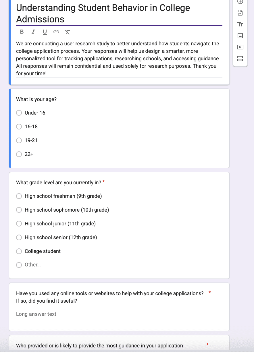 |
|
User Persona & Journey Mapping
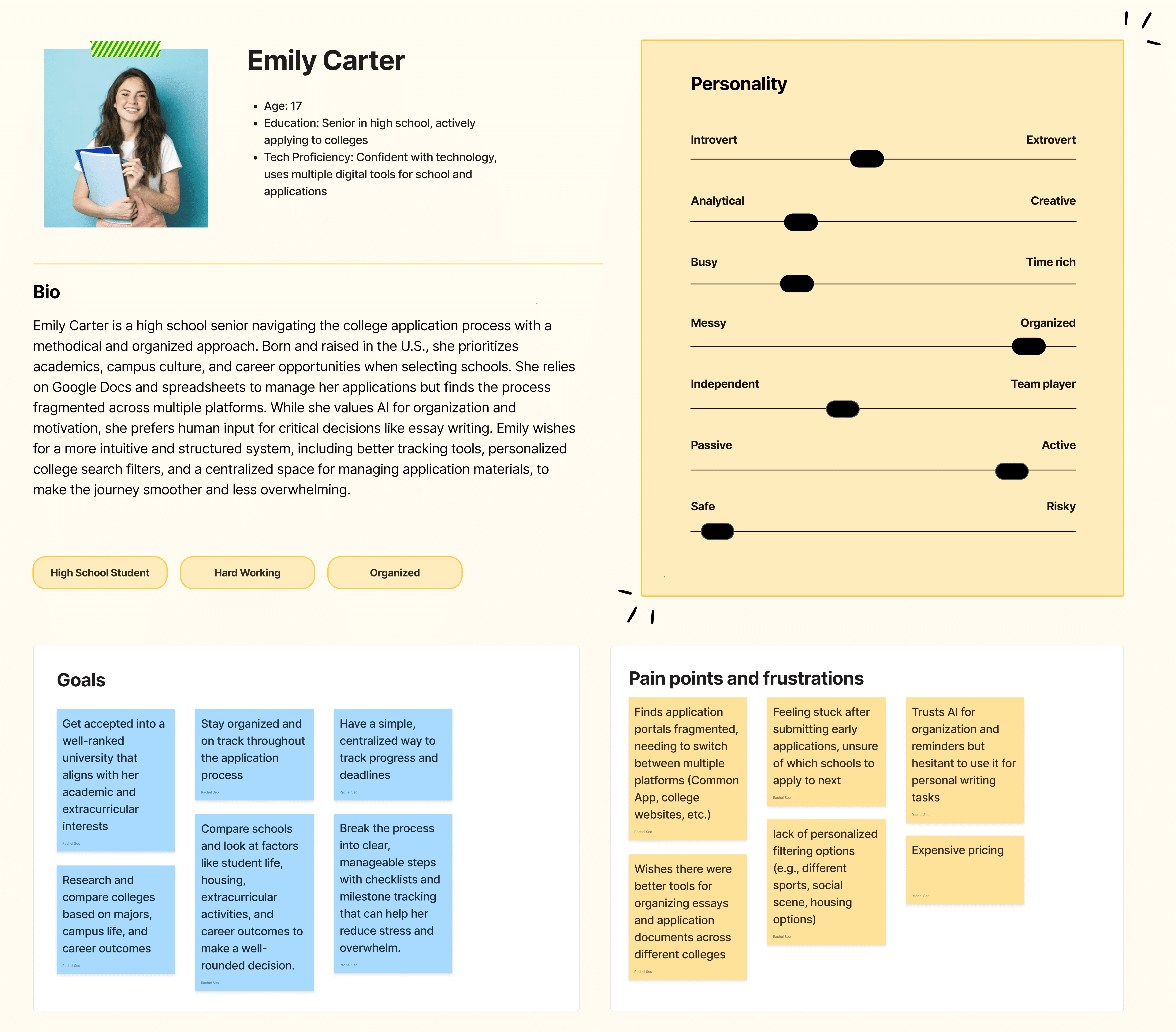
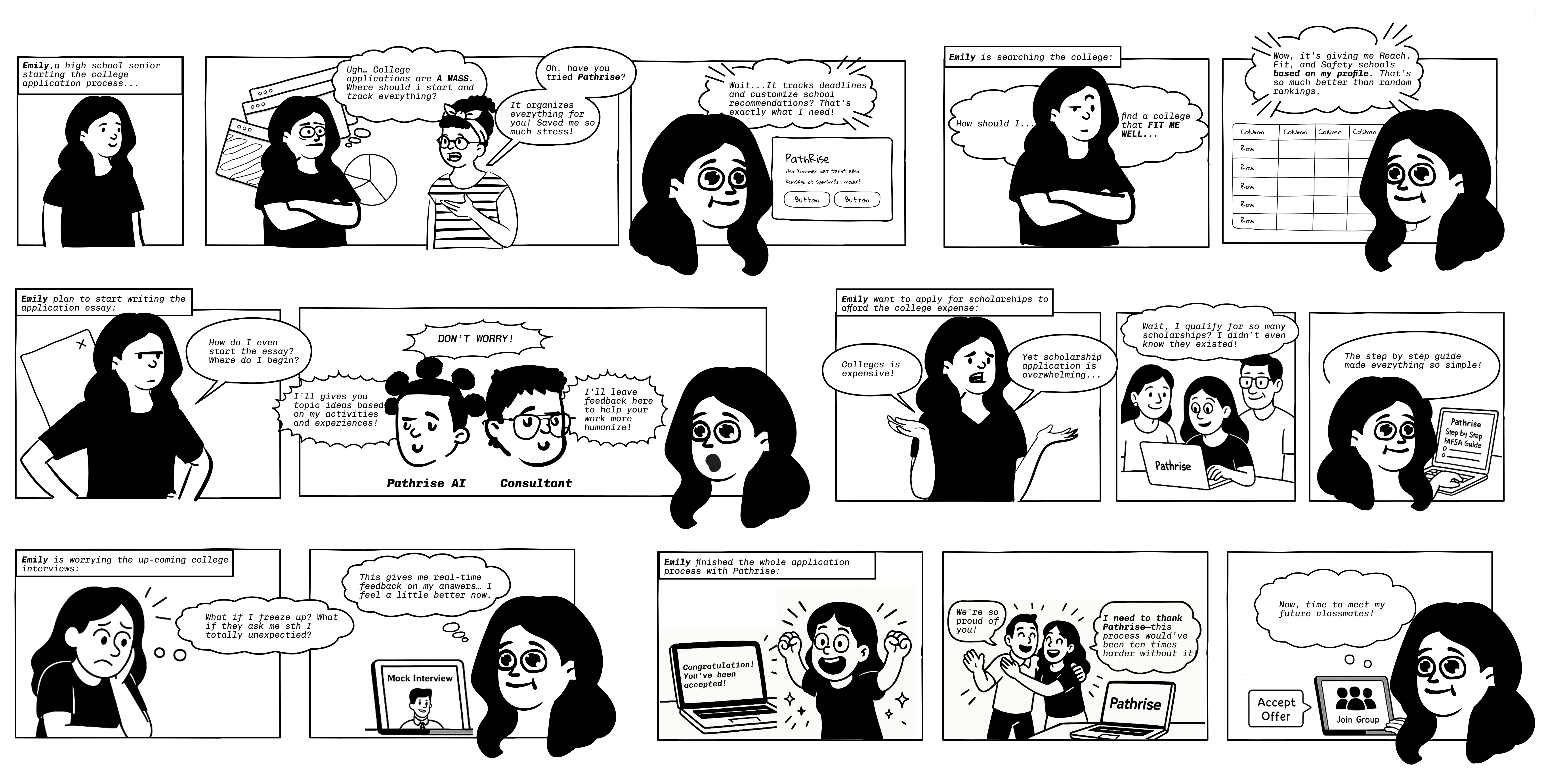
Based on the findings, we created a user persona and a journey map on FigJam, to storyboard a complete user experience.

FROM PAIN POINTS TO DESIGN DIRECTION
Based on research, I mapped major user pain points to solution concepts and UX strategies.
Pain point | Solution | UX Enhancement |
|---|---|---|
Fragmented Portals |
|
|
Lack of transparency on why that certain school is recommended (students couldn't trust the AI) |
|
|
|
|
|
Financial Aid Confusion |
|
|
Interview Anxiety |
|
|
Digital wireframes
Below are a selection that represent part of the work I designed on Figma, each addressing major challenges.

To address the frustration of generic, opaque recommendations, students can now compare schools side by side, adjust filters, and understand why each school was suggested by the short label.

This tracker centralizes deadlines and tasks, using color-coded statuses to make progress clear at a glance.


Conclusion
Next Steps | Reflection |
|---|---|
This project concluded at the low-fidelity stage because Pathrise, as an early startup, shifted focus to securing investment and building its founding team. Design efforts paused to prioritize business alignment before moving toward a full MVP. Next steps would include usability testing with students, refinement into high fidelity designs, and integration with tools such as the Common App and calendar platforms. | This project strengthened my understanding of designing for high stakes, emotionally loaded workflows. I learned that clarity and transparency matter more than visual complexity, and that trust in AI systems depends on giving users both explanation and control. |
More Projects



UX Research / Web Design
Internship Project: UX Research & Wireframing
A real world internship project focused on user research and low fidelity prototyping for an early stage AI-powered college planning platform. While the project paused during the startup’s investment phase, the research and design work established a clear foundation for future development.
Year :
2025
Industry :
AI
Tool :
Figma, FigJam
Project Duration :
3 months+
Overview
As a UI/UX Design Intern at an early stage startup, I worked on building a platform to support high school students through the college application process. I conducted competitive analysis, led user research and testing, and designed low-fidelity wireframes for features including AI driven college matching and application tracking.
My Role
UX Researcher & UI/UX Designer
Collaborated with: Founder and Design team
Focus areas: user research, user interview, ideation, and wireframing
Problem Statement
High school students manage college applications across fragmented tools such as spreadsheets, search platforms, and school portals. This creates stress, missed deadlines, and difficulty comparing options.
In testing an existing market tool, students found AI matching features unclear and difficult to trust. Important decision making details such as GPA requirements, test policies, and early decision rules were hard to find, leaving students unsure how recommendations were generated.
Students needed a single workspace that organized tasks and deadlines while offering transparent and adjustable AI recommendations.
Competitive Analysis
Before beginning user research, we first studied the existing market to examine how current college application platforms support students, and where they fall short.
User Research
Methods | Key Insights |
|---|---|
|
|
User Survey sent to high school students via Google Form |
|
User Persona & Journey Mapping
Based on the findings, we created a user persona and a journey map on FigJam, to storyboard a complete user experience.
FROM PAIN POINTS TO DESIGN DIRECTION
Based on research, I mapped major user pain points to solution concepts and UX strategies.
Pain point | Solution | UX Enhancement |
|---|---|---|
Fragmented Portals |
|
|
Lack of transparency on why that certain school is recommended (students couldn't trust the AI) |
|
|
|
|
|
Financial Aid Confusion |
|
|
Interview Anxiety |
|
|
Digital wireframes
Below are a selection that represent part of the work I designed on Figma, each addressing major challenges.
To address the frustration of generic, opaque recommendations, students can now compare schools side by side, adjust filters, and understand why each school was suggested by the short label.
This tracker centralizes deadlines and tasks, using color-coded statuses to make progress clear at a glance.
Conclusion
Next Steps | Reflection |
|---|---|
This project concluded at the low-fidelity stage because Pathrise, as an early startup, shifted focus to securing investment and building its founding team. Design efforts paused to prioritize business alignment before moving toward a full MVP. Next steps would include usability testing with students, refinement into high fidelity designs, and integration with tools such as the Common App and calendar platforms. | This project strengthened my understanding of designing for high stakes, emotionally loaded workflows. I learned that clarity and transparency matter more than visual complexity, and that trust in AI systems depends on giving users both explanation and control. |
More Projects
UX Research / Web Design
Internship Project: UX Research & Wireframing
A real world internship project focused on user research and low fidelity prototyping for an early stage AI-powered college planning platform. While the project paused during the startup’s investment phase, the research and design work established a clear foundation for future development.
Year :
2025
Industry :
AI
Tool :
Figma, FigJam
Project Duration :
3 months+
Overview
As a UI/UX Design Intern at an early stage startup, I worked on building a platform to support high school students through the college application process. I conducted competitive analysis, led user research and testing, and designed low-fidelity wireframes for features including AI driven college matching and application tracking.
My Role
UX Researcher & UI/UX Designer
Collaborated with: Founder and Design team
Focus areas: user research, user interview, ideation, and wireframing
Problem Statement
High school students manage college applications across fragmented tools such as spreadsheets, search platforms, and school portals. This creates stress, missed deadlines, and difficulty comparing options.
In testing an existing market tool, students found AI matching features unclear and difficult to trust. Important decision making details such as GPA requirements, test policies, and early decision rules were hard to find, leaving students unsure how recommendations were generated.
Students needed a single workspace that organized tasks and deadlines while offering transparent and adjustable AI recommendations.
Competitive Analysis
Before beginning user research, we first studied the existing market to examine how current college application platforms support students, and where they fall short.
User Research
Methods | Key Insights |
|---|---|
|
|
User Survey sent to high school students via Google Form |
|
User Persona & Journey Mapping
Based on the findings, we created a user persona and a journey map on FigJam, to storyboard a complete user experience.
FROM PAIN POINTS TO DESIGN DIRECTION
Based on research, I mapped major user pain points to solution concepts and UX strategies.
Pain point | Solution | UX Enhancement |
|---|---|---|
Fragmented Portals |
|
|
Lack of transparency on why that certain school is recommended (students couldn't trust the AI) |
|
|
|
|
|
Financial Aid Confusion |
|
|
Interview Anxiety |
|
|
Digital wireframes
Below are a selection that represent part of the work I designed on Figma, each addressing major challenges.
To address the frustration of generic, opaque recommendations, students can now compare schools side by side, adjust filters, and understand why each school was suggested by the short label.
This tracker centralizes deadlines and tasks, using color-coded statuses to make progress clear at a glance.
Conclusion
Next Steps | Reflection |
|---|---|
This project concluded at the low-fidelity stage because Pathrise, as an early startup, shifted focus to securing investment and building its founding team. Design efforts paused to prioritize business alignment before moving toward a full MVP. Next steps would include usability testing with students, refinement into high fidelity designs, and integration with tools such as the Common App and calendar platforms. | This project strengthened my understanding of designing for high stakes, emotionally loaded workflows. I learned that clarity and transparency matter more than visual complexity, and that trust in AI systems depends on giving users both explanation and control. |